Crop Marks

When I research photo collections, nothing makes me happier than finding crop marks. And crop marks on contact sheets of medium format film (or larger) really are fantastic because so much of the detail of the image is clear, and the intention of the markings is usually more apparent. Crop marks make visible what is normally invisible to us … the reshaping and reimagining of the image long after the point of exposing a film emulsion to light. They can be produced by the photographer, an editor, a client – anyone with an interest in how, and in what form, the photograph will circulate. They are usually done to suit the next stage of the post-photographic process, which means that cropping is not simply an aesthetic statement (although it can be).

Crop marks are an act of foreshadowing, a projection of what might be. Unlike most images captured on a contact sheet, those with crop marks have been chosen for printing, and thus will find new life in some print form. The act of cropping, then, implies the next stage, this new context. And even the new print is not intended (usually) to sit in isolation, but is imagined as a part of a new layout, a new format, a new ‘home’ for the image with new relationships produced and forged in the discursive spaces of conversations with other texts and images around it. Whether on an editorial page, an advertisement, or an exhibition gallery, the marking of a contact sheet is the first stage of imagining that picture in this new space.

The materiality of the photograph is an essential element to understanding what “cropping” means. Positive colour transparencies (such as slides) have a special relationship to cropping, because there’s very little that one can do after the photograph is taken. The exposure, the horizons, the composition – none of this can be changed after the fact through later darkroom techniques or (today) digital postproduction. Cropping was the one thing that could be done, as long as the remaining image didn’t get too small. So during my parents’ camera club slide shows I recall lots of discussion and talk about cropping, both in critiquing images to promote better composition, and in suggesting ways to enhance an existing slide. The process was accomplished by taking the film out of the cardboard edge holder, laying it on a light table, carefully masking the side that needed to be hidden from view with special tape, and then re-mounting it in a holder. Of course the crop taping needed to be absolutely straight and perfectly parallel, or else you were in trouble.

Detail of one frame from a contact sheet with crop marking, 1967. Photographer unknown.  Imperial Oil Collection, Glenbow Archives.

Detail of one frame from a contact sheet with crop marking, 1967. Photographer unknown. Imperial Oil Collection, Glenbow Archives.

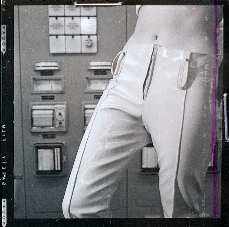
With negatives, where the intended output is usually a positive print, cropping is often expected and, indeed, planned. Photographers frequently allow a bit of spillover in the edges because it’s easier to crop it out than to put something back in from beyond the frame.  In the picture above, slicing off the right-hand side gives the impression of slimness and keeps the eye focused on the shiny PVC pants on display.

The process of cropping can be rendered invisible when the decisions are made on the fly, literally in the darkroom with only eyes of the print developer aware of what she or he is putting in or leaving out. However, in the larger corporate world of visual production, where different people are involved in the production process (editors, designers, photographers, darkroom technicians, admen, creative directors, clients, etc.), crop marks on a contact sheet reflect a chain of command that inscribes a set of decisions. Crop marks are a kind of “memoranda” issued by executives or middle managers to the technicians who do the actual work in producing the print. They are expressions of power that reflect not only a reshaping of the image, but also point to organizational processes, and social/economic hierarchies.  It’s unclear if the markings below are for actual cropping, or point to directions for dodging/burning or some other reworking of the negative.  The image does not stand on its own, but seemingly calls for the intervention of the purple marker.

jvc2

Detail of three frames from a contact sheet, 1967. Photographer unknown. Model: Barbara Fulton. Imperial Oil Collection, Glenbow Archives.

It’s easy to jump from negative or print, or from print to image, without thinking about the middle stages of production. These points of transition carry the inscriptions of power that mark off not simply what frame to use, but also what parts of the frame to focus on. They determine what can and what can’t be seen, extracting a very small slice from a much larger set of cultural negotiations that surrounded the photographic session to begin with.

For copyright reasons, most of the contact sheets I work with can’t be reproduced here, without considerable red tape, but the Glenbow Archives generously granted me verbal permission to post images I came across while researching advertising photographs in the Imperial Oil photographic collection.  I haven’t yet found where these particular images were used, but they were taken in September, 1967, at an Imperial Oil PVC plant in Sarnia, Ontario.  The model is identified as Barbara Fulton, described as an “Esso Reporter, writer,” and she likely worked for the company’s internal magazine.  So we have an employee recruited to model PVC clothing at a PVC plant for an oil company, and we simultaneously have a writer’s body being re-inscribed by the editorial marks that will direct how her image is refined and processed.  And before we can hold the final print in hand, the photograph will need to go through yet more layers of mechanical and chemical alterations.  It is here in the crop marks where we really see the point of collision between cultural, the aesthetic, the corporate, and the technical.

Detail of contact sheet, 1967.  Photographer unknown. Model, Barbara Fulton. Imperial Oil Collection, Glenbow Archives.

Detail of a contact sheet, 1967. Photographer unknown. Model, Barbara Fulton. Imperial Oil Collection, Glenbow Archives.

Of course, especially in the context advertising photographs in the 1960s, the editorial crop marks re-assert a masculine gaze. Fulton’s words may or may not have accompanied a magazine story about the Sarnia plant or the PVC clothes she was wearing, but she likely had no role in choosing which images to illustrate the story, or how those images were re-framed, re-cropped, and re-imagined.  Exposing the hidden processes of cultural production calls attention to such acts of erasure, and reminds us that the photograph is not, and has never been, a stable or fixed entity.

Walking Away

A recent picture of my daughter, walking down a boardwalk.

Boardwalks are for walking.

Except that as I was scanning through my digital files, I happened to come across this picture, of my daughter walking down a boardwalk, three-and-a-half years earlier.

Deja vu – Walking Away Again.

Same perspective, same framing, even the boardwalks turn left at the end. But different places, different seasons, and pictures taken 42 months apart. How did I manage to recreate this image twice, with such a complete unawareness of the earlier image? Is this a kind of camera “tunnel vision” that kicks in, whereby my eye is looking for that sense of “depth” which the lines of the boardwalk provide? Or is it something else? As far as I can tell, I don’t think there’s a single image of my son walking away down a boardwalk, so why does it always seem to be my daughter that I’m catching in this particular moment?

There’s undoubtedly an unconscious internalization of compositional aesthetics that helps to explain why the framing is similar. Indeed, photographs of children on boardwalks are a common motif (and I don’t claim any great originality in these images). But I think that there’s also something about the aesthetics of nostalgia itself that run deep in these two photographs. Representing my youngest child, my daughter, as an independent being (and a determined walker!), moving forward on a path (but still safely inside the railings?), offers links to other kinds of narratives at play. If nostalgia was not present in the making of the image, it is certainly there in the archiving, re-viewing, and remembering them over time, where the temporal dimensions are marked by less by the changing seasons and more by the changing, growing body in the middle of the frame. It’s not easy to separate the father from the photographer in these pictures.

The running joke growing up in my family of photographers is that if people were in the picture, then it must have been taken by Mom. Dad’s photographs at this time in his career focused largely (although not exclusively) on scenic works. Perhaps I am guilty here of over-aestheticising a family moment, taking a memento of a trip and trying to turn it into something bigger. Or maybe it’s a reflection of deeper, subconscious anxieties about what “walking away” symbolizes, that mixture of excitement and trepidation that always hangs in the balance.

Or maybe my daughter just likes walking away from me, and being out on her own. Perhaps not surprisingly, the image below shows her around the age of 1. It was one of the first photographs that I printed and framed for her room. Ever the determined walker.

Walking Away

Yes, I do also take pictures of my kids with faces showing, in case anyone’s wondering.

Time for a Rainbow

After spending too much time following the flood news from southern Alberta, it’s time to post a rainbow.  This image was taken just a week or two before the floods hit, on a quick trip to visit the farm (which is far from water so no worries about damage).  Of all the comments I get from students and colleagues related to an article I wrote about my parents’ photography in the 1970s and 1980s, the image that always gets mentioned is Dad’s picture entitled “Rainbow’s End” which shows a massive rainbow over the now-vanished elevators at Pulteney.  (shameless plug: article is here, with colour plates!)  This is a pretty poor imitation of Dad’s work, although the building in the photograph is actually the last remaining “original” granary left on the farm.  Ignore the fact that I’ve ignored most of the rules of composition.

IMG_8969-Edit

Rainbows aren’t unique to the prairies, but one sees them differently here, thanks to the wide horizons, vivid light, and fast-moving storm systems that can leave half the sky black and the other half brilliantly blue.  Although I try not to get too (overtly) sentimental or romantic in thinking about and looking at prairie landscapes, it’s hard not to get all Kermit-y in the face of a rainbow.

Vivian Maier Film Trailer

Over the past few weeks, the photography class has been discussing the documentary impulse, different expressions of ‘street’ photography, and gendering the photographer / subject / gaze.  I mentioned that extraordinary example of Vivian Maier, which raises all kinds of interesting questions about not just her own body of work, but the question of ‘found’ photographs and the power of the art world to retrospectively declare someone a visual ‘artiste’.

Check out the trailer for a forthcoming documentary about Maier and her collection of work.  The photographs are certainly stunning:

Instagram Invasion

I’ve been working on this post for a long time, but it never got posted because new things about Instagram kept cropping up — almost daily, it seems.  But just recently Instagram changed its terms of agreement to give itself the right to sell users’ photographs, including commercial rights, which is causing a bit of an uproar.  I may come back to the question of digital rights in a later post, but for the moment let’s keep the focus on the aesthetic issues that originally got this post rolling.

Brad Mangin, a professional sports photographer, raves about his iPhone and using Instagram, which allows him to both share and tweak the photographs in order to give them a retro look.  He even gets them published in Sports Illustrated. (Although one wonders how professional photographers in particular will feel about the new terms of agreement!).

In contrast, over at the Guardian, Kate Bevan argues that “Instagram is debasing real photography,” and suggests that apps like it are the “antithesis of creativity.”  Joe Macirowsky has even built Normalize, an app that takes instagrammed-photographs and returns them to “normal.”  Photography discussion boards are full of derision for instagrammed photos.

A more interesting argument is Joerg Colberg’s piece on “Photography After Photography? (A Provocation),” which is a broader exploration of digital photography and the question of artistic boundaries, but has this to say specifically about these types of apps:

There is no artistry here other than the application of some software filter that in a very deterministic way makes your new digital photograph look old. So there is no chance. Art without a trace of chance, a trace of an accident isn’t art. No artistic risk, not art … What is more, it’s deeply reactionary, but in an uncommitted way. You could, for example, buy a real old camera and stuff film into it, to create your genuine old-timey photographs, but that effort isn’t even made. It’s a pointless nostalgia, where you’re yearning for just that one aspect of the past without all the rest.

I have actually made a somewhat similar argument in discussing the landscape photography of my parents and their camera club years of the 1970s and 1980s.  Pointing to the curious movement within digital photography programs towards adopting the colour grain and characteristics of particular slide films, I suggested that “Such visual enhancements offer a retro veneer that invokes a particular nostalgic mood, but they ignore the wider mode of how such technologies and the active pursuit of photography shaped the view.” (p. 286, Placing Memory and Remembering Place in Canada – sorry for the shameless book boosting!).

However, despite believing that not enough attention is paid to “modes” of picture taking, I don’t agree that adding filters is necessarily “pointless nostalgia.”  Nor do I think it’s productive to denigrate “the masses” for manipulating their own images in whatever fashion suits them, even if it’s horribly done (or horribly hipster-ish).  I think that it’s more productive to ask why certain aesthetics find new traction in new technological form.  Do “lo-fi” techniques offer a way to ‘humanize’ a clinical, cold, modernist device like a smartphone?  Is it a particular attachment to the 1970s as a time period, when colour film was rather unstable, variable, and subject to all kinds of purposeful and accidental developing techniques?  Is this a visual attraction that parallels certain audio nostalgic leanings, such as the popularity of the Sheepdogs or Blitzen Trapper’s American Goldwing? (Both HIGHLY recommended, btw – and these examples don’t even cover the whole folk revival of things like the autoharp, of all things)  Or is it a kind of uncertain lamentation for the decline of film, and the film industry symbolized by Kodak’s bankruptcy and the erasure of its presence on the North American landscape.

Photography itself is arguably the quintessential modernist technology, as Joan Schwartz argues, and yet it has consistently cloaked itself in rather antimodernist forms.  Kodak was selling nostalgia as early as the late-19th C, marketing cameras as a way to “capture memory” and to hold on to childhood.  In the twentieth century, I have written about Ernest Brown, an Edmonton-based photographer who claimed that his massive collection of glass plate negatives were not simply an historical record, but were valuable because he was trained in the “old ways” of photographic development and offered purchasers of his historical albums assurances of his artistic craftsmanship in using the “purest” of chemicals.  Photography, it seems, has always been ‘old’ and yet, is always on the edge of the ‘new.’  Digital photography may have unmoored the image from its emulsions, but its indexical power remains embedded in its assumed temporal and geographical attachments.  Adding retro filters is about playing with the temporal dimensions of the photograph, juxtaposing the visual cues of previous eras with what we know is the current grounding of the 21st C digital object.  Whether or not this is a “reactionary” or “progressive” artistic endeavour is perhaps worth debating, but it is far from simply trying to make “bad” photographs look “good.”  Perhaps in an age that is arguably swamped with a surplus of images, such tweaking is an extension of our desire to customize, to personalize, to have our pictures say more than simply “I was here, then”.

Last August, Instagram topped Twitter in terms of the number of times the app was accessed on mobile devices.  Is it any surprise that Twitter now has its own filters?

One can’t comment on Instagram without having a little bit of humour, so here’s a beautiful parody of Nickelback’s song, Photograph. (contains a bit of raw language, so young tender ears be warned).

Acknowledgement: many of the links in this post (but not all) came to my attention through petapixel.com.

Looking West

John D. Dorst’s book, Looking West, explores visual practices and ways of seeing that he argues are particular to the American West, but also characteristic of modern “western” consumer culture.  Through a close reading of a photograph (reproduced on the cover), Dorst takes a studio portrait of Buffalo Bill Cody and Sitting Bill and dissects the multiple lines of sight, gazes, and sets the whole image against the background of a standard joke about Native peoples as “unseen seers” — the two subjects share the same plane, but not the same authority, and not the same gaze.

Distance can be a disorienting feature of prairie landscapes.  Mountains might look near, but are actually quite far away.  On the farm for July 1, we were able to watch fireworks from a neighbouring town – 16 km away!

Looking west with a 300 mm lens that compresses the perspective and makes the mountains look comparatively larger.

Seeing things differently then, has regional connotations that are rarely explored.  Visiting Calgary during Stampede, my son immediately noticed that everyone dressed up to a degree that he had never experienced before — from clerks to cashiers to bankers, dressing the part is a regular part of civic duty during those ten days in July (along with pancake breakfasts on a massive industrial scale).  But dressing the part is not necessarily “seeing things” the same way — and there has never been unanimity about exactly which “western” traditions the Stampede is supposed to symbolize.  Indeed, within the Stampede grounds, there are many ways of looking — from corny gimmicks and midway extravaganzas to the small scale inspection of cow and horse breeds, from big-tent professional rodeo events to the more intimate events that showcase horsemanship on a much smaller (and ethically more acceptable) way.  And of course it was the hottest Stampede in memory which meant that many noticed the lack of attire worn by some ( google “Calgary Trampede” for more blogs that comment on this aspect of the show ).  Add in the complicating gazes of the Indian Village and a Canadian military display that had a missile with a saddle on it for kids to ride ( or for stoners to recreate the infamous scene from Dr. Strangelove, I guess ) and it doesn’t take long to agree with Dorst that “The optical discourse that stands at the heart of our advanced consumer social order is itself brought up close for inspection, sometimes in funny or offhand ways, in the vast text of the West.” (p. 9)

So, in honour of gazes seen and unseen at the Stampede, a quick shot of a fiddler — part of a family of fiddlers — who, just after I took this picture, started playing their own acoustic version of Guns ‘N Roses’ “Sweet Child of Mine.”  Really.

Camera Design Nostalgia

Olympus has produced a new camera.  Or an old camera.  Take your pick.

Olympus OM-D

Surprisingly little has been written about the fundamental tension between the camera as a penultimate expression of modernist technology, and the photograph which has come to stand for quintessentially antimodernist tendencies – nostalgia, memory, longing.  Digital imaging, however, has started to merge what were once fairly clear trajectories.  It was not surprising that software manufacturers started to mimic film in how images were post-processed, although the extent to which lomography, cross-processing, and other techniques (which, as my father would say, used to be called simply “bad” photography) now dominate the digital imaging vernacular (Exhibit A:  See Instagram).  The more we can reshape the image, it seems that the less we want it to look like an actual digital artefact.

However, the nostalgia for the analog print technique appears to be moving back up the food chain and it is cameras themselves which are being re-visioned according to “classic” analog predecessors.  Thus, Olympus’ OM-D recalls the heritage of its classic OM series line of SLRs, introduced in 1972.  I never used Olympus film cameras, but sometime in the early-1980s my parents bought me a Pentax MX, which shared very similar aesthetics, although it had a very different design philosophy.  It was a lot of camera for my age – indeed, it was the same model my father used, and a step above the one my mother used – but since I ended up using it for almost 20 years, it was apparently worth the investment.

The Pentax MX was a flagship camera for the company, and was produced from 1976 to 1985.  The MX was proudly manual – no program modes, no automatic focus, no shutter / aperture priority, no exposure compensation options.  It did have depth of field preview (the funny lever above), and through the lens metering with a half-click of the shutter release button.  I learned how to take exposure readings on neutral grey areas and adjust shutter or f-stops accordingly.  It was mated to a bizarre 45-125 mm f4 Pentax zoom lens, which was passably sharp but slow and heavy.

But nostalgia’s a funny thing.  The MX was my companion for almost 20 years.  But after many years since then of ergonomic grips on solid digital cameras, pulling the MX out again to take some pictures of it revealed to me how awkward the camera really was.  The lens made it feel unbalanced, the straight lines made it difficult to grip properly, the molded plastic was rough and unscratchable, but not something I’d want to return to.  These were cameras that were built to serve the film, to maximize its own efficiencies as a machine – the photographer adapted themselves to the machine, rather than the other way around.

Without film, many of the mechanical constraints of early cameras are no longer in play, and yet the return of particular features (like the large pentaprism on top), haunt us as design aesthetics.  If instagram and other photo filters are any indication, then the market for these kind of retro designs is not people with actual experience using the film SLR predecessors, but those who were born with digital imaging, and who imagine those earlier ages as perhaps embodying a more “authentic” experience of photography.  It’s hard to tell if this more upscale version of hipsterism is simply the creation of marketing firms, or if there are deeper questions at stake (in our collective psyche? – whatever that is) ; perhaps we are still uncomfortable with the idea of digital imagery and the impermanence and instability it, potentially, represents.  Such designs reassure us, although it’s hard to imagine what a “classic” digital camera might look like in the future – will it be the au courant retro designs that appeal to present and near future collectors, or will it be the avant-garde of today that will become nostalgic objects of desire in the future?  Or perhaps it is the idea of the camera itself – a machine with the sole function of producing a still image – that will be the new point of retro desire, given the onslaught of integration with other features (from high-end HD video to smartphones) that threatens to dissolve the camera as an entity.

You Are What You Drive

A while ago the Digitizing History MA class produced a website on car advertisements called You Are What You Drive. Some of the details on this project are available here.

In that vein, check out Andrew Bush’s series of photographs of people driving cars.  They are remarkably rich portraits.  The cropping of the images at the windshield makes the car windows themselves a kind of frame for the occupants inside, and avoids fetishizing the car itself.

Boston’s Lieux de Mémoire

As a tourist, it’s hard to escape the scaffolds of public memory in a place like Boston.  As much as it embraces a resolute sense of cosmopolitan modern (like the Institute for Contemporary Art and more commercial endeavours that have reshaped the harbourfront in the last ten years), it is a place of profound memorialisation – both tacky and heartfelt, new and old.  When the day you visit is the tenth anniversary of 9/11, well, escaping the memorial – as a site, as an act, as feeling – is almost impossible.

So a study in contrasts: three images that speak to different times, different memories, different scales and spaces of memorializing.  But all from Boston on a memorable weekend away.

George Washington equestrian statue, 1869, Boston Commons

JFK library

John F. Kennedy Pesidential Library and Museum.

Old North Church Memorial Garden

Old North Church Boston Memorial Garden, blank dogtags commemorating American Armed Forces personnel who have died in Afghanistan and Iraq.

Stop Motion Part II: Flashback

So after finishing a post on Muybridge and stopped time, I come across references to a video by Japanese band, Androp.  Using no CGI (apparently), the video producers/designers wired together 250 Canon cameras with flashes.  At first it seems like all they are doing is a pretty standard strobe effect (cue high school dance flashback here – look man, I’m doing the robot).  But around 2:58 you’ll see that they use images from the cameras behind the band to create a completely different sense of motion.  Lots of technical discussion over at Strobist regarding what they actually used to create the effects, but I find it interesting that the video starts with a careful set of shots emphasizing the technical setup.  T. G. Hamilton‘s multiple cameras were fired off by flash in the dark during seances, but only when the spirits told him to take the shot.  Maybe ghosts in the machine could create their own light show with this kind of setup.